



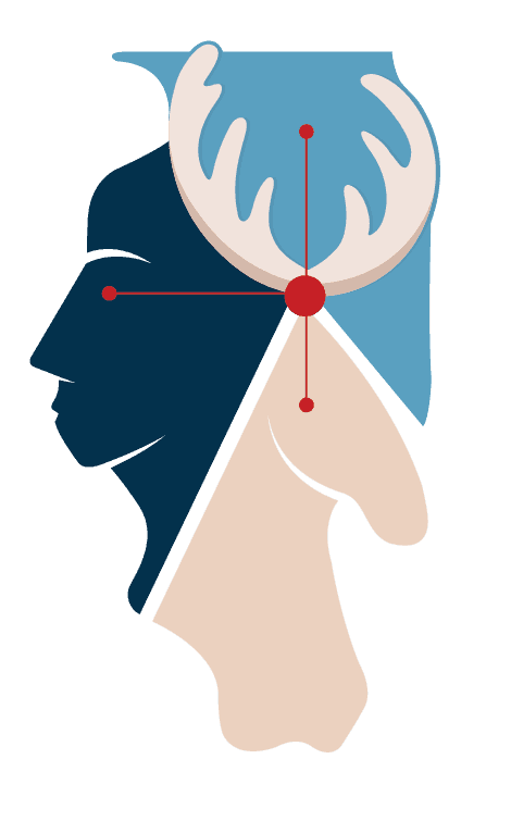
Illinois state
Human
AI
Oak leaf
Deer
State animal

One mark. Multiple connections.
I focused on figuring out how the system should work rather than how it should look. I used low-fidelity sketches to explore onboarding flows, handle missing information, and understand how different features depend on each other.

Shape of individual characters connect at the center of logo.
Subtle visual element that represents AI bringing the three areas together
Three sections are divided with equal amount of spacing
Giving the mark a visual language
With the logo structure established, I explored color and typography to create an identity that reflects One Health Illinois' interconnected approach to health.
Distinct visual elements converge around a shared center, representing the interconnected systems at the heart of the
One Health approach.




5 core elements
Color directions
Connected & Contemporary
A cooler teal palette paired with a bright accent to introduce energy and contrast. This palette was inspired by recognised Illinois state colours.


b. Warm & Human
Color exploration focused on balancing trust and clarity with warmth and human connection.

II. Typography
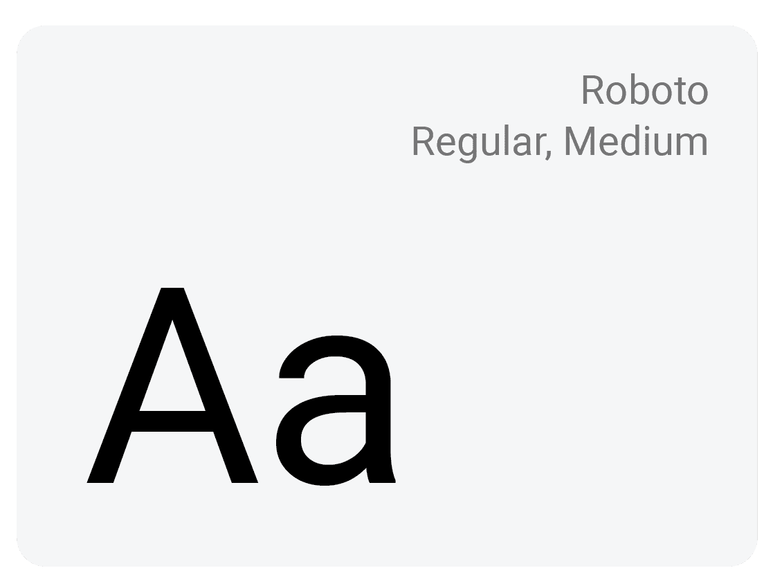
Roboto provides a clear, accessible typographic foundation, allowing the logo's more organic forms to remain the visual focus.


Similar Templates