Documentation and Typeface Creation

Research and documentation


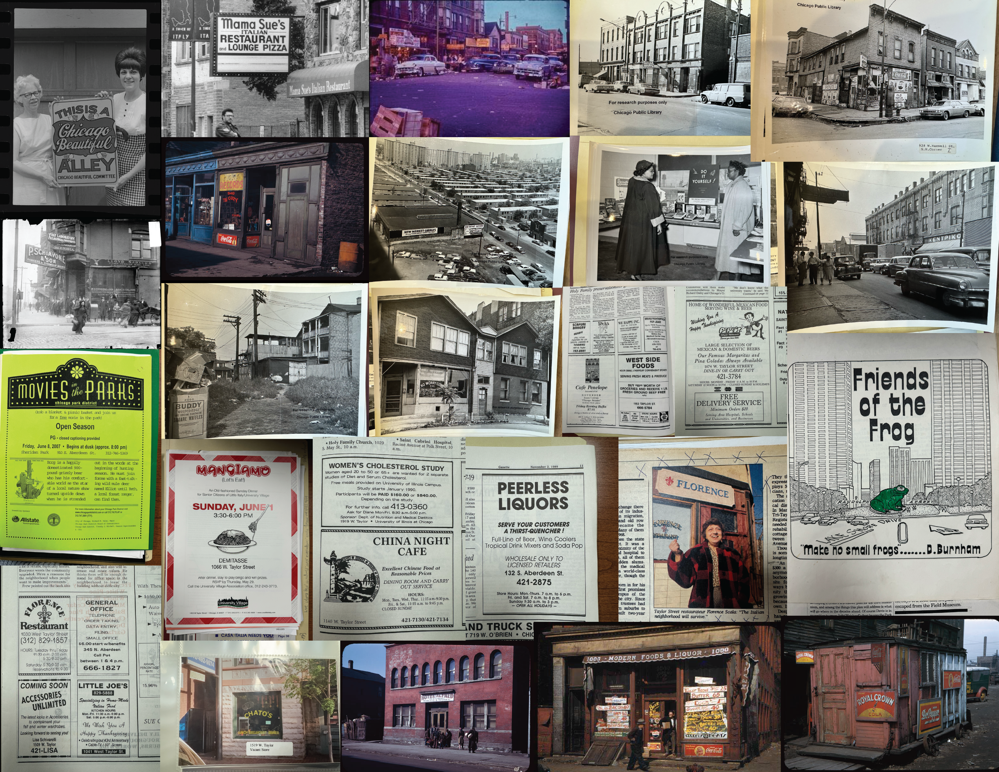
This project focused on researching the Little Italy neighborhood community. It involved exploring archival content and collecting visual elements from the area's architecture and diverse restaurants, which represent various cultures and highlight the neighborhood's evolution over time.

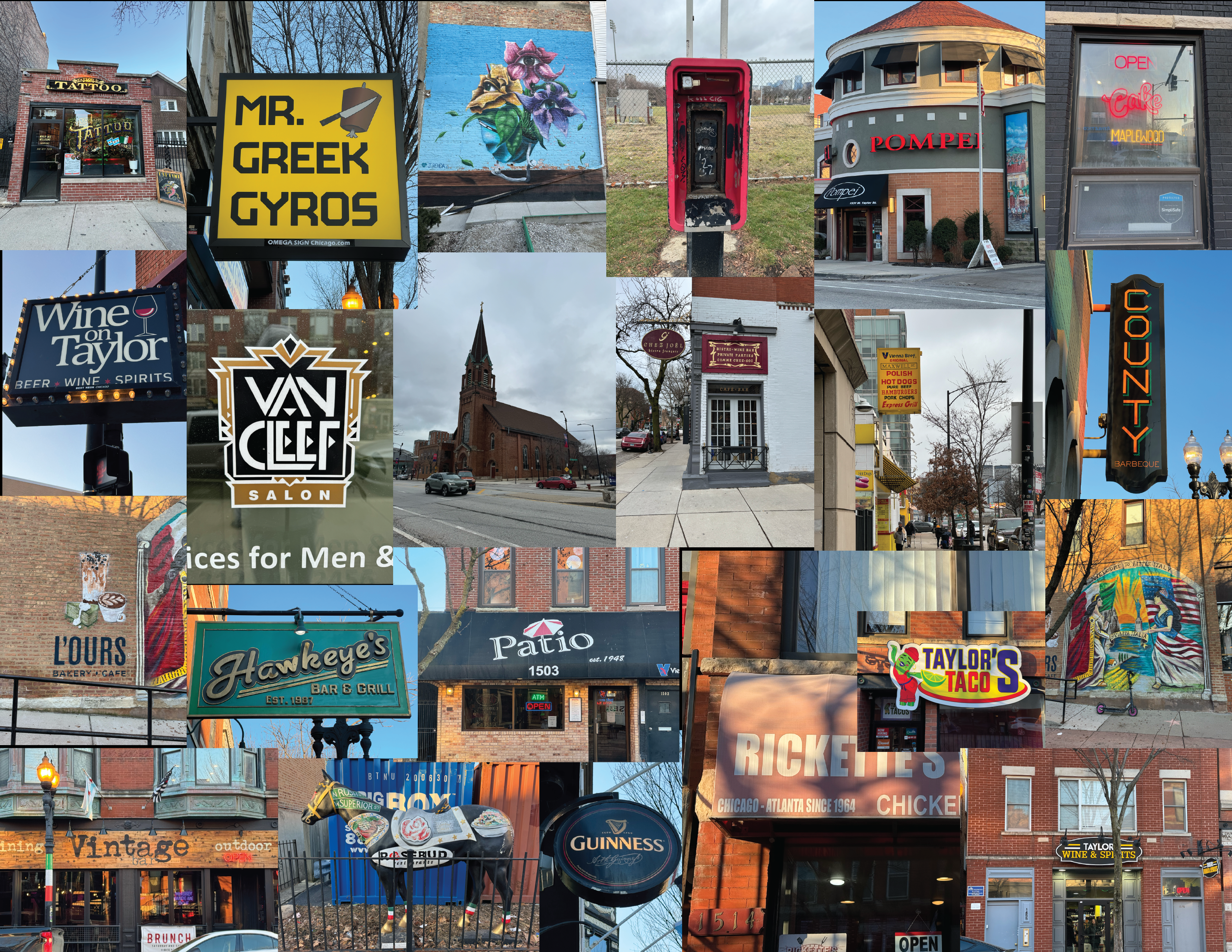
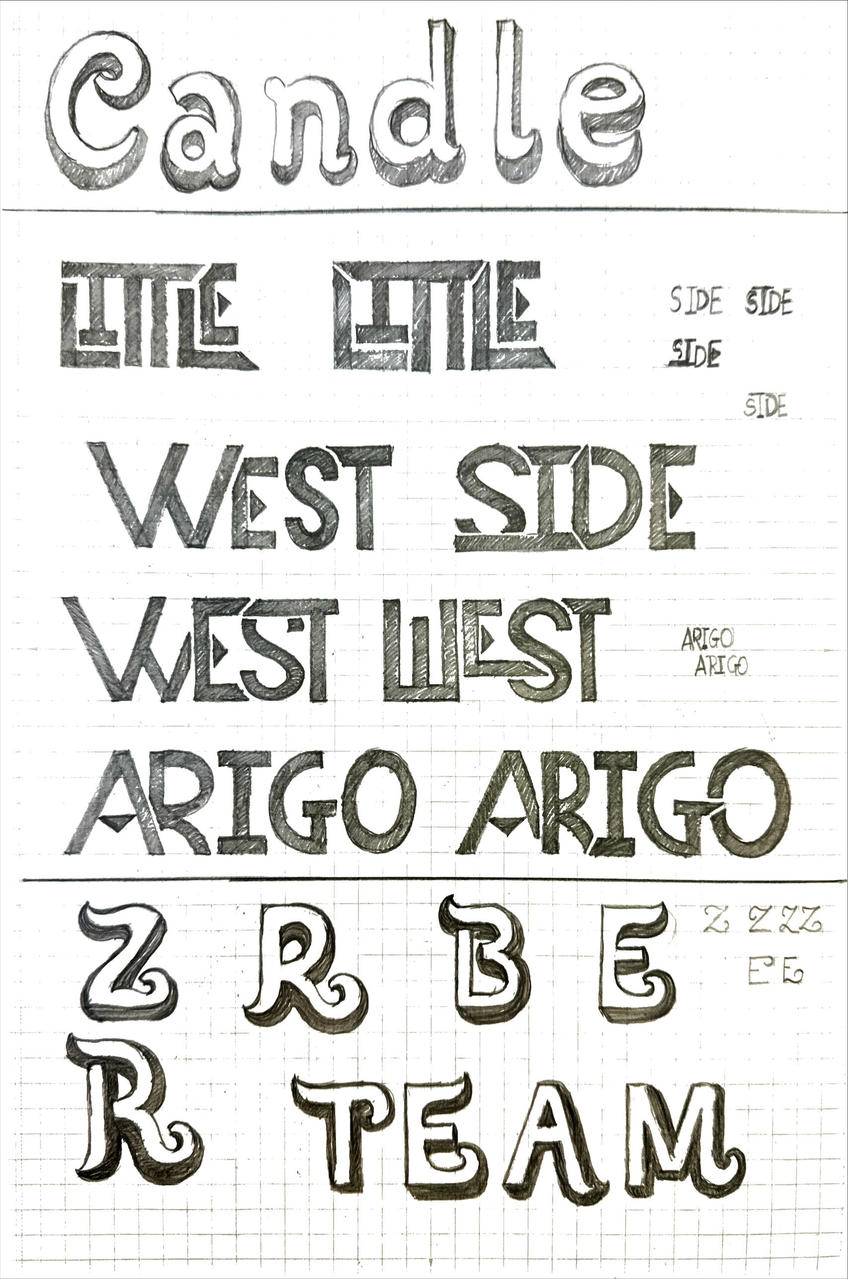
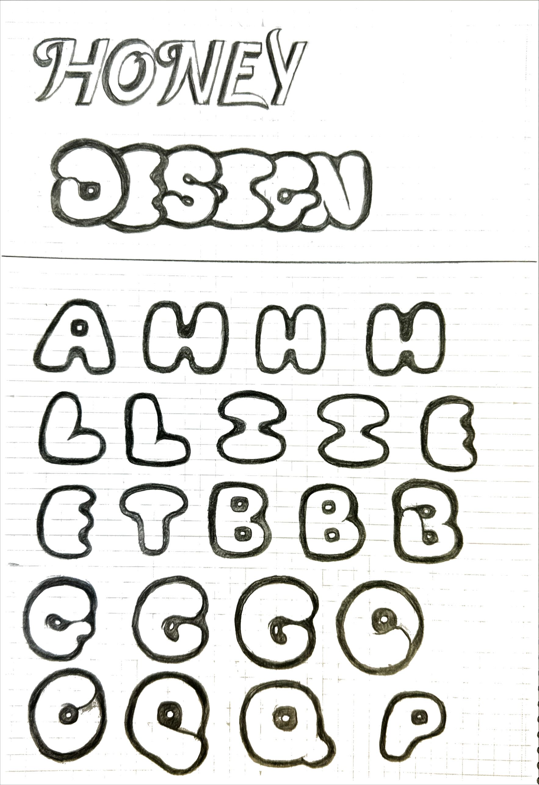
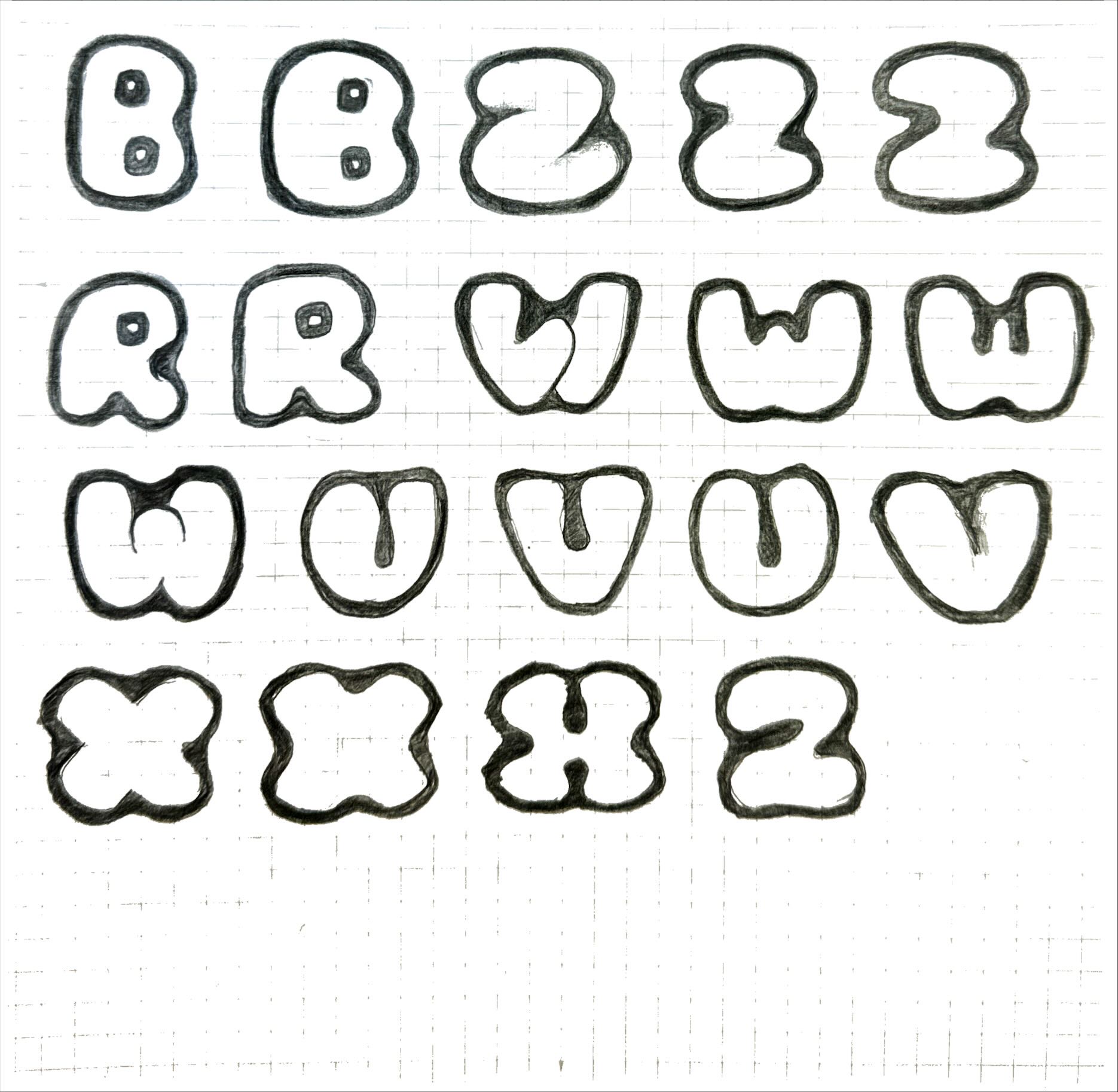
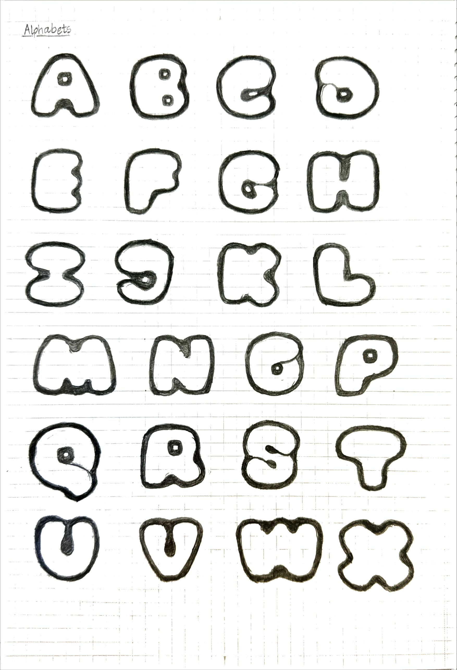
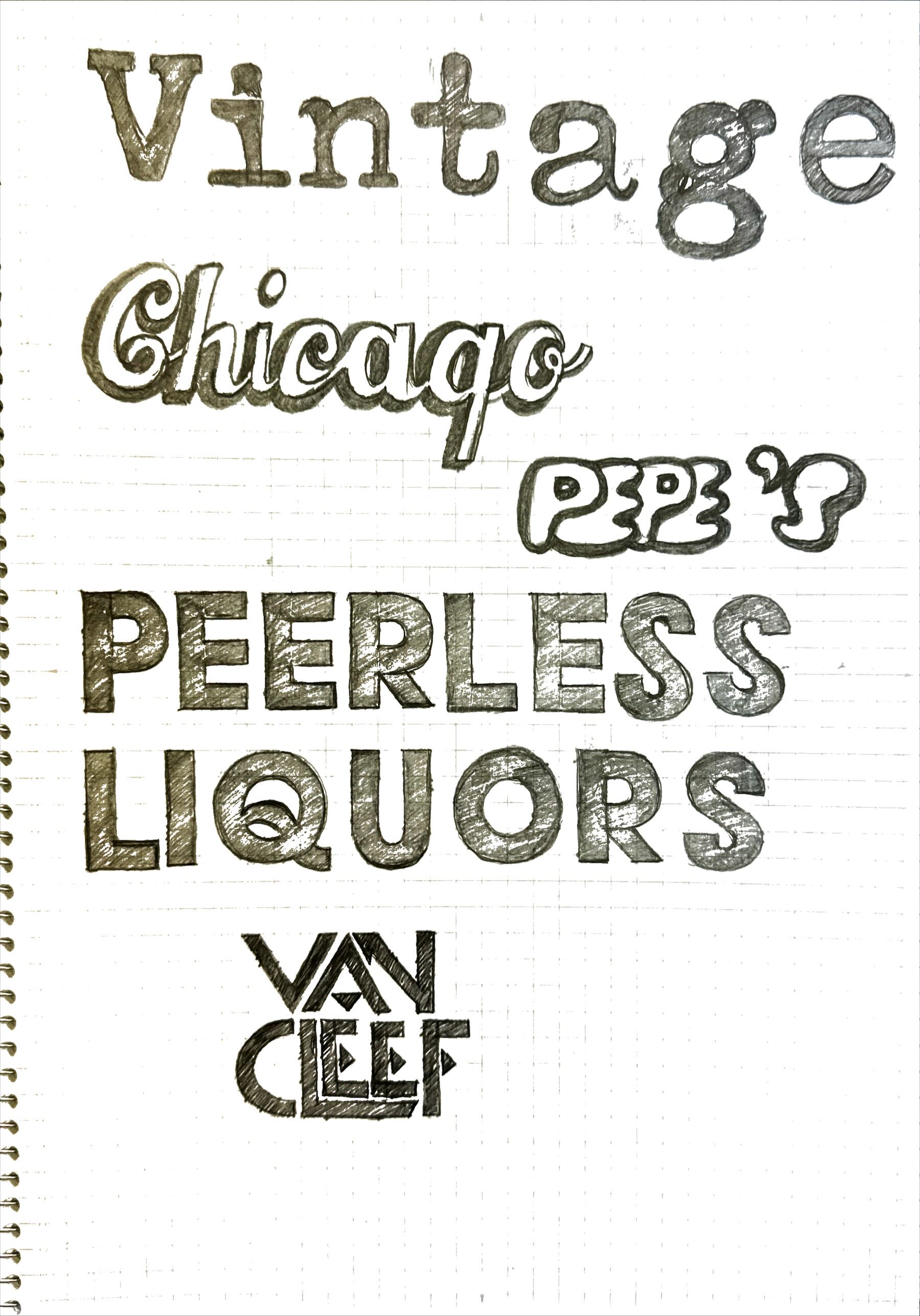
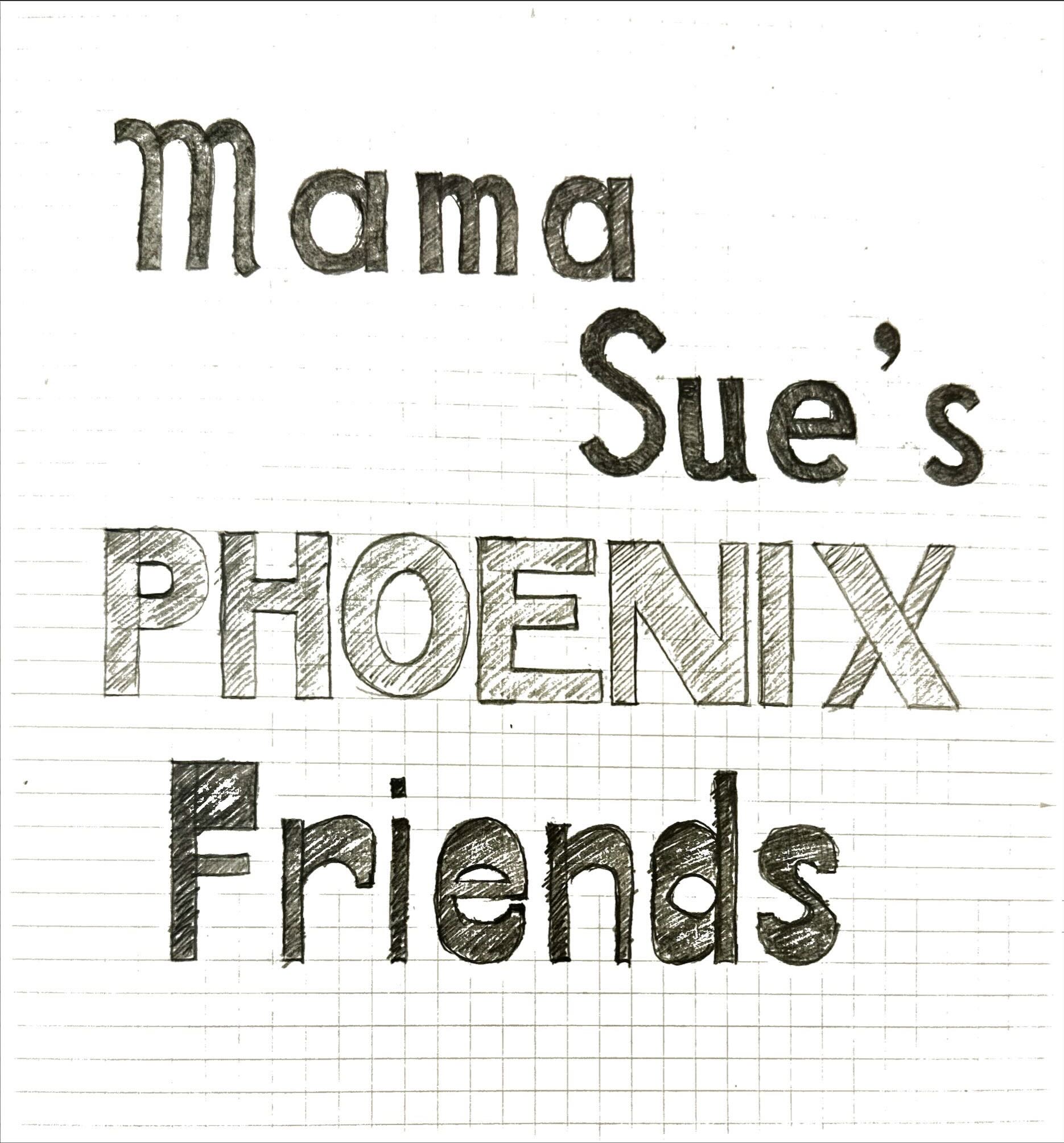
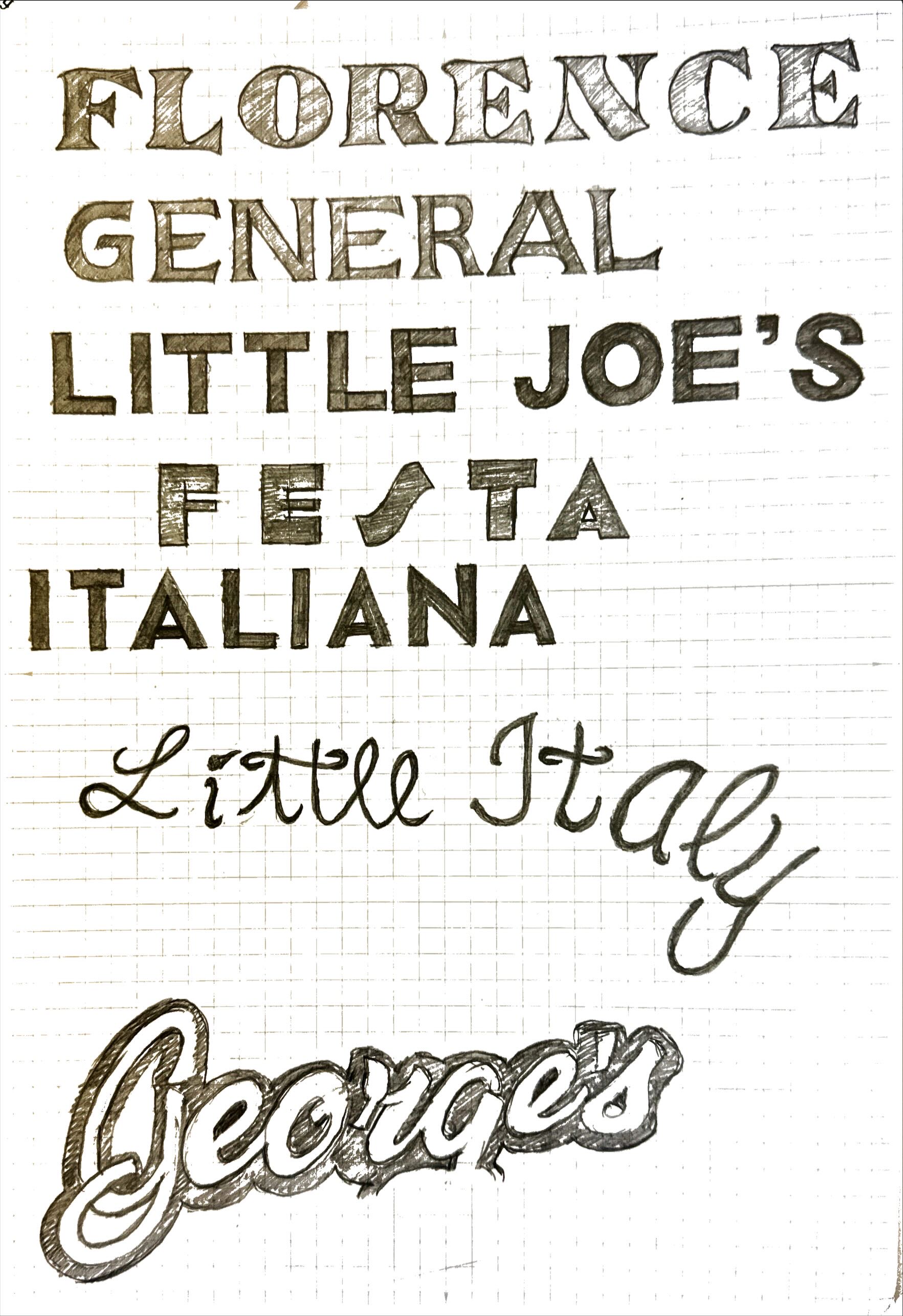
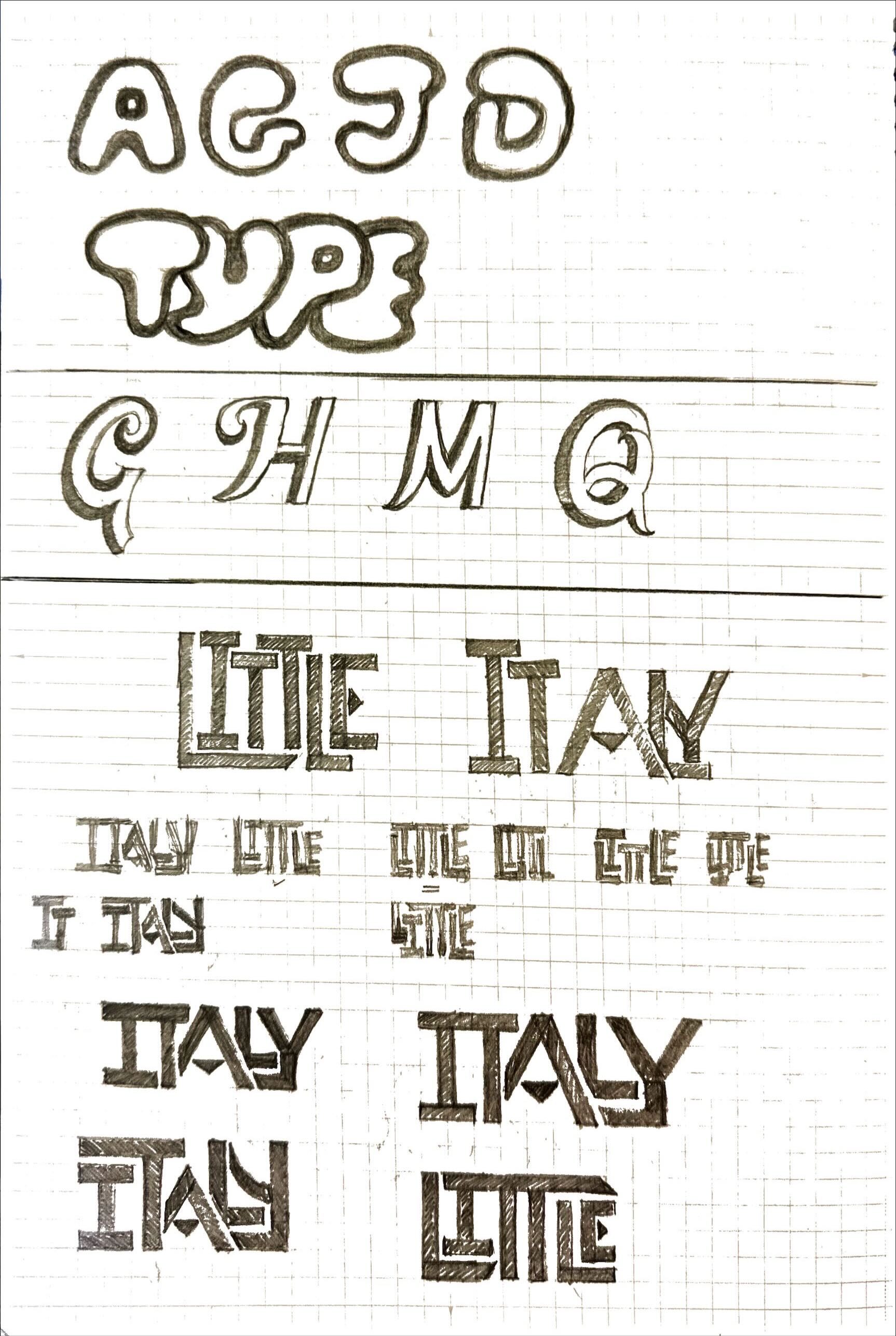
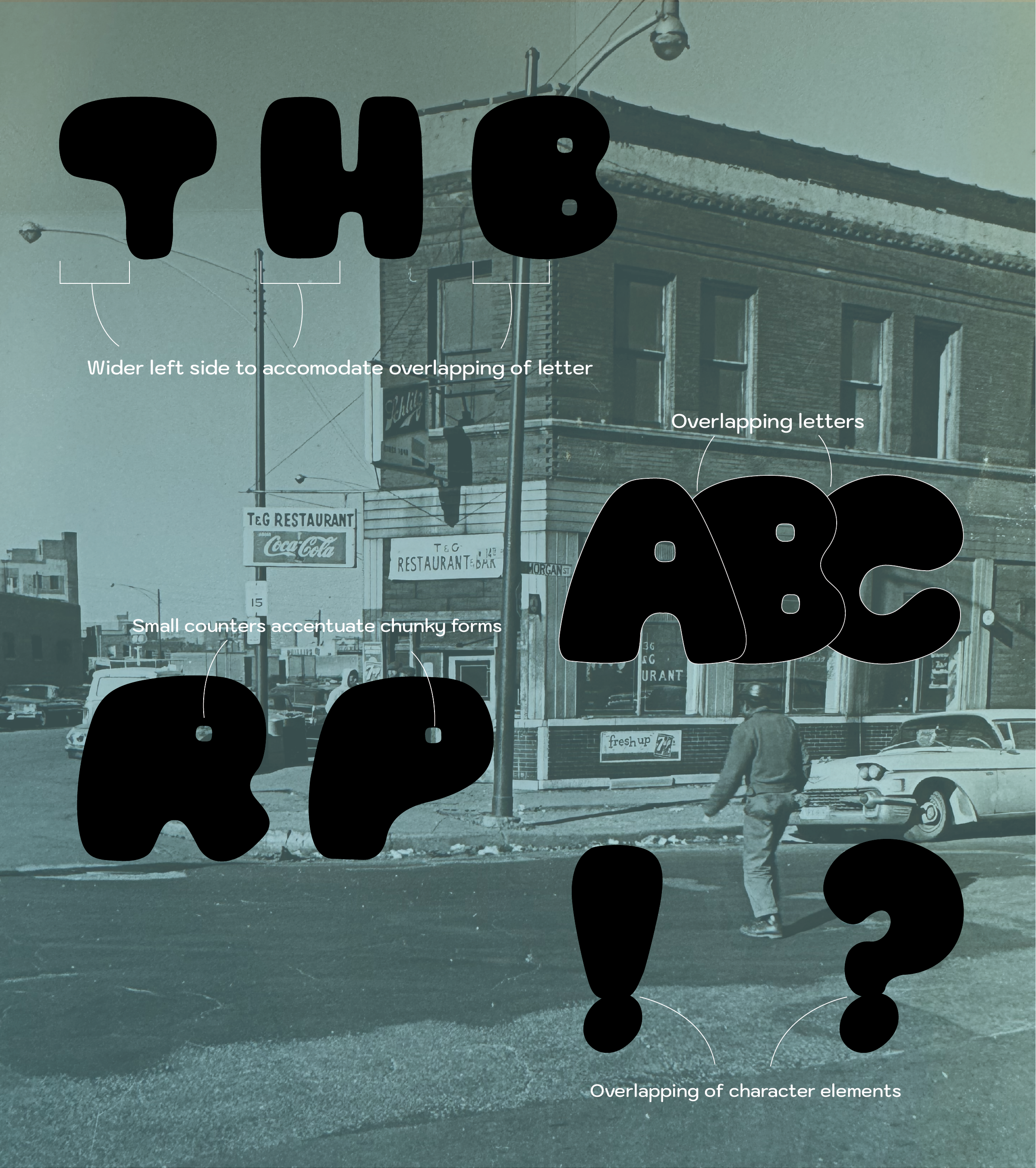
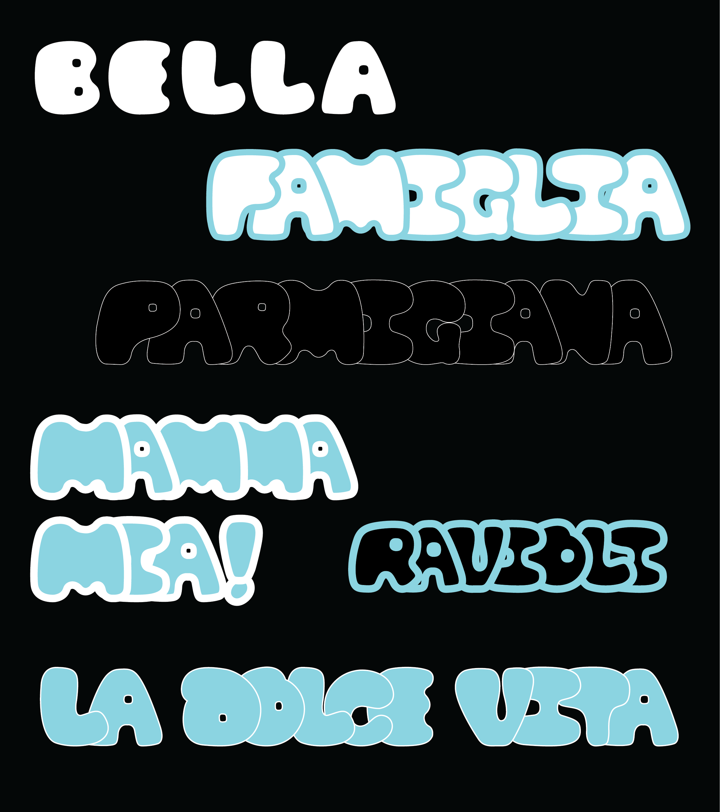
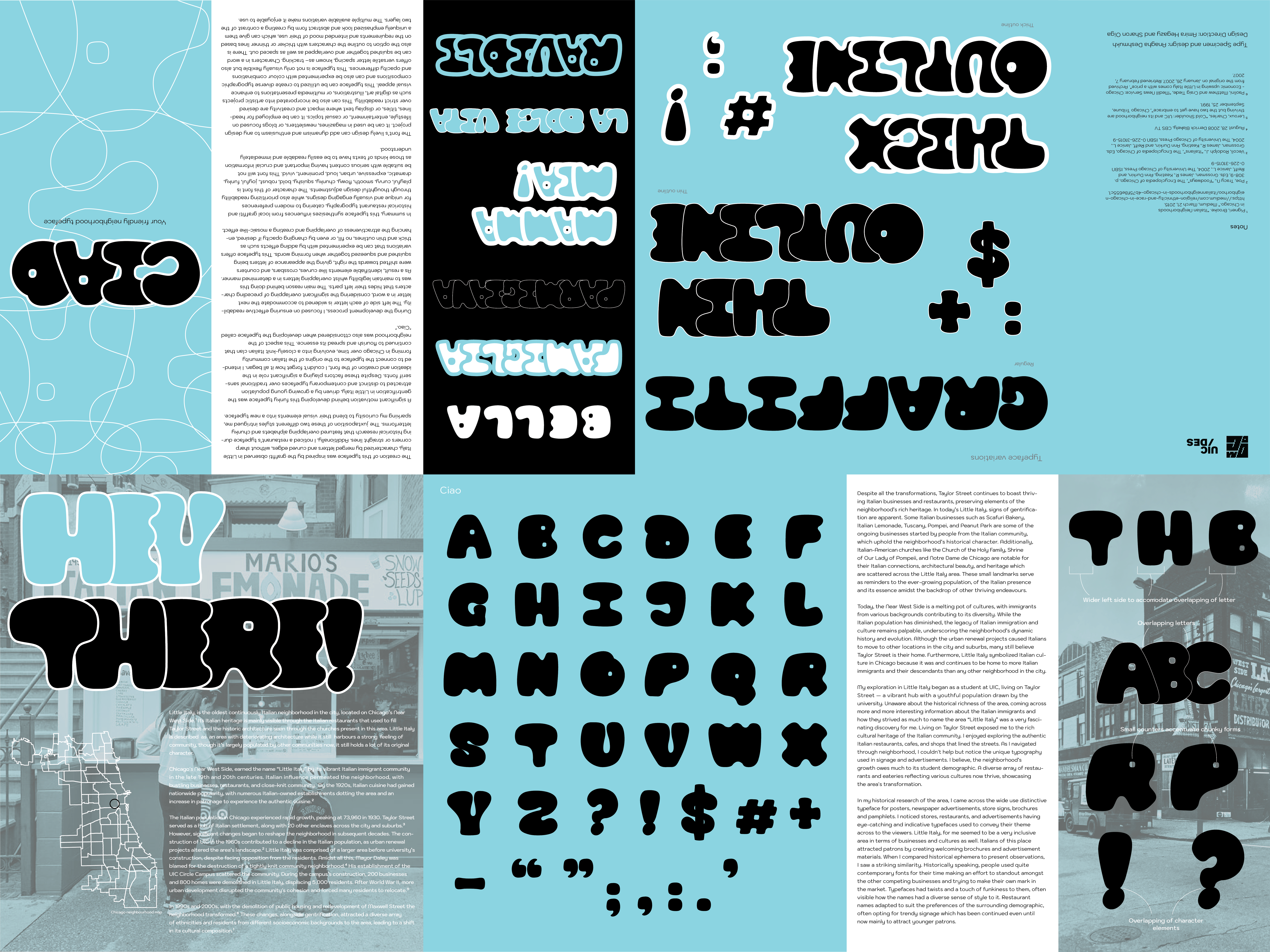
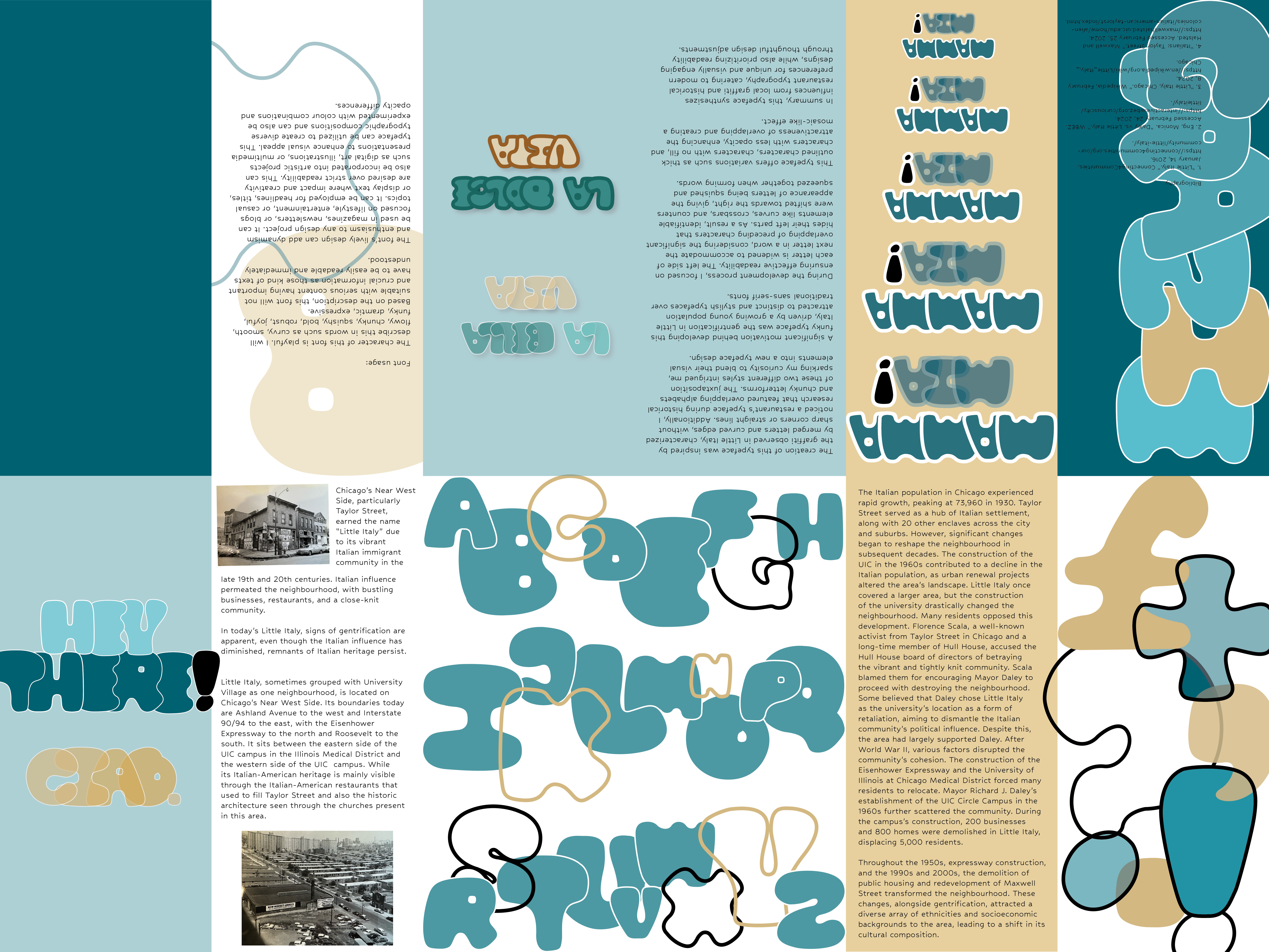
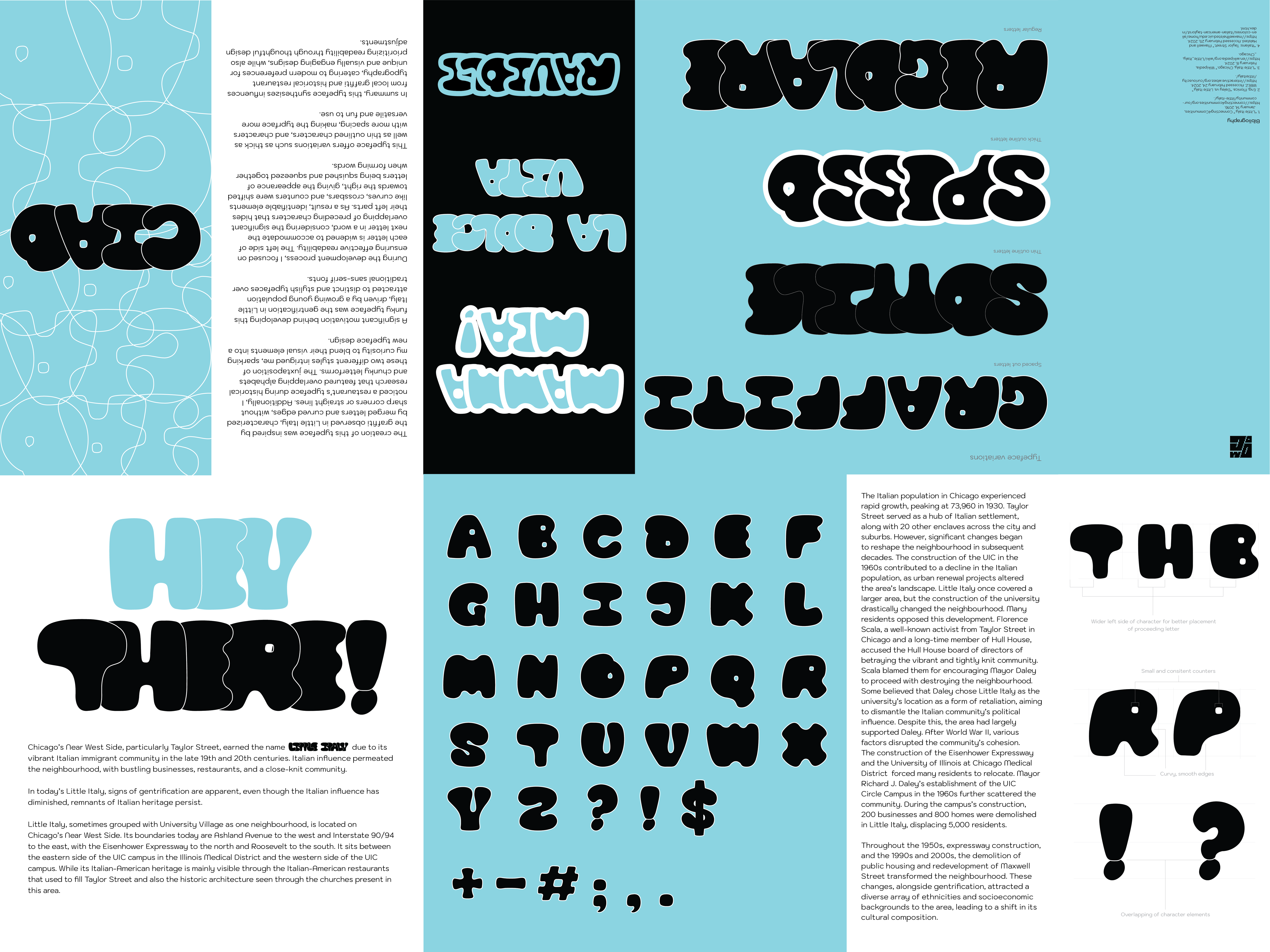
In today's Little Italy, signs of gentrification are apparent, even though the Italian influence has diminished, remnants of Italian heritage persist. In my historical research of the area, I came across the wide use of distinctive typeface for posters, newspaper advertisements, store signs, brochures and pamphlets. I noticed stores, restaurants, and advertisements having eye-catching and indicative typefaces used to convey their theme across to the viewers. Little Italy, for me seemed to be a very inclusive area in terms of businesses and cultures as well. Italians of this place attracted patrons by creating welcoming brochures and advertisement materials.

Historically speaking, people used quite modern fonts for their time making an effort to stand out amongst the other competing businesses and trying to make their own mark in the market. Typefaces had twists and a touch of funkiness to them, often visible how the names wanted to have a diverse sense of style to it. Restaurant names adapted to suit the preferences of the surrounding demographic, often opting for trendy signage which has been continued even until now mainly to attract younger patrons.

Image 1 Image 2

Sketches


The typeface development process began with sketching existing letterforms, starting by tracing restaurant names. This helped in understanding their structural nuances, stroke variations, and unique characteristics. From there, the sketches were refined, deconstructed, and adapted to form a cohesive typographic system. In this whole process, it is important to note that this typeface is not a representation of the Italian community but the concept is inspired by it.

Image 3 Image 4 Image 6 Image 7 Image 8 Image 9 Image 10 Image 11

Final Zine Design and Typeface


The creation of this typeface was inspired by the graffiti observed in Little Italy, characterized by merged letters and curved edges, without sharp corners or straight lines. Additionally, I noticed a restaurant’s typeface during historical research that featured overlapping alphabets and chunky letterforms. The juxtaposition of these two different styles intrigued me, sparking my curiosity to blend their visual elements into a new typeface.

A significant motivation behind developing this funky typeface was the gentrification in Little Italy, driven by a growing young population attracted to distinct and contemporary typefaces over traditional sans-serif fonts. Despite these factors playing a significant role in the ideation and creation of the font, I couldn't forget how it all began. I intended to connect the typeface to the origins of the Italian community forming in Chicago over time, evolving into a closely-knit Italian clan that continued to flourish and spread its essence. This aspect of the neighbourhood was also considered when developing the typeface called "Ciao."

Image 3 Image 4 Image 4 Image 4
Image 3

Previous Zine Versions


Initially, I explored a more abstract approach, but I simplified the form to enhance recognition and give it more structure. Reducing color clutter by focusing on a single dominant hue.

Image 3 Image 3

Design Method


During the development process, I focused on ensuring effective readability. The left side of each letter is widened to accommodate the next letter in a word, considering the significant overlapping of preceding characters that hides their left parts. The main reason behind doing this was to maintain legibility whilst overlapping letters in a determined manner. As a result, identifiable elements like curves, crossbars, and counters were shifted towards the right, giving the appearance of letters being squished and squeezed together when forming words. This typeface offers variations that can be experimented with by adding effects such as thick and thin outlines, no fill, or even by changing opacity if desired, enhancing the attractiveness of overlapping and creating a mosaic-like effect.

In summary, this typeface synthesizes influences from local graffiti and historical restaurant typography, catering to modern preferences for unique and visually engaging designs, while also prioritizing readability through thoughtful design adjustments.

Font usage


The character of this font is playful, curvy, smooth, flowy, chunky, squishy, bold, robust, joyful, funky, dramatic, expressive, urban, loud, prominent, vivid. This font will not be suitable with serious content having important and crucial information as those kinds of texts have to be easily readable and immediately understood.

The font’s lively design can add dynamism and enthusiasm to any design project. It can be used in magazines, newsletters, or blogs focused on lifestyle, entertainment, or casual topics. It can be employed for headlines, titles, or display text where impact and creativity are desired over strict readability. This can also be incorporated into artistic projects such as digital art, illustrations, or multimedia presentations to enhance visual appeal. This typeface can be utilized to create diverse typographic compositions and can also be experimented with colour combinations and opacity differences. This typeface is not only visually flexible but also offers versatile letter spacing, known as– tracking. Characters in a word can be squished together and overlapped as well as spaced out. There is also the option to outline the characters with thicker or thinner lines based on the requirements and intended mood of their use, which can give them a uniquely emphasized look and abstract form by creating a contrast of the two layers . The multiple available variations make it enjoyable to use.