Designing posters using a random process has opened up opportunities to explore combinations I might not have imagined otherwise. This approach has sparked spontaneity and led to creative discoveries, such as unexpected visual connections, bold layouts, striking color schemes, and unique typography. I’ve realized that this method can bring a layer of visual complexity that draws viewers in, encouraging them to interpret the design and uncover meanings or connections that I may not have consciously included. At the same time, I’ve learned that too much randomness without a clear structure or purpose can lead to designs that feel chaotic and hard to follow. This concept has also made me think about how the design reflects my personal style or artistic influences, what this process has taught me about my creative strengths and limitations, how I build layers of meaning, and the ways I challenge conventional aesthetics or techniques in my work.
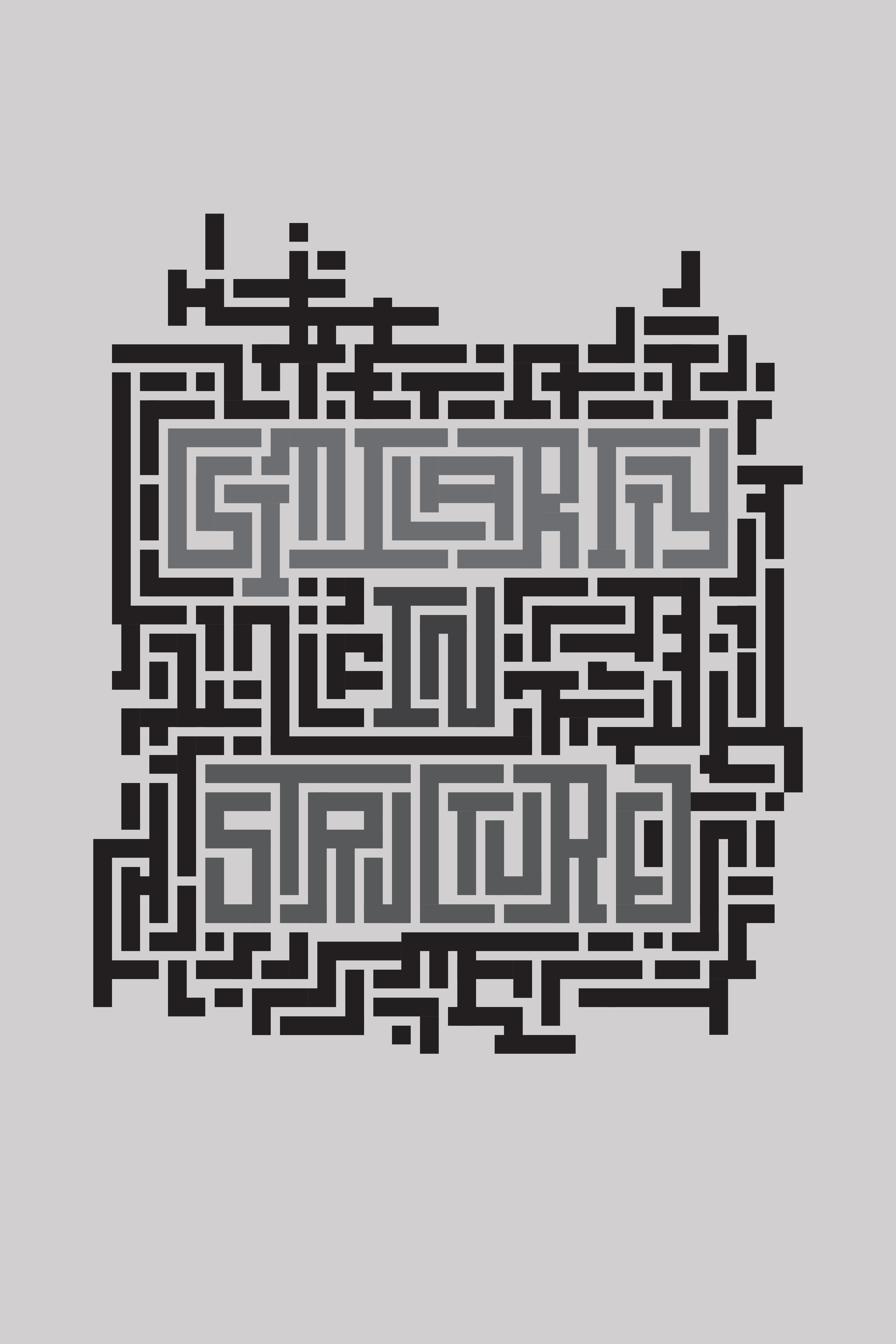
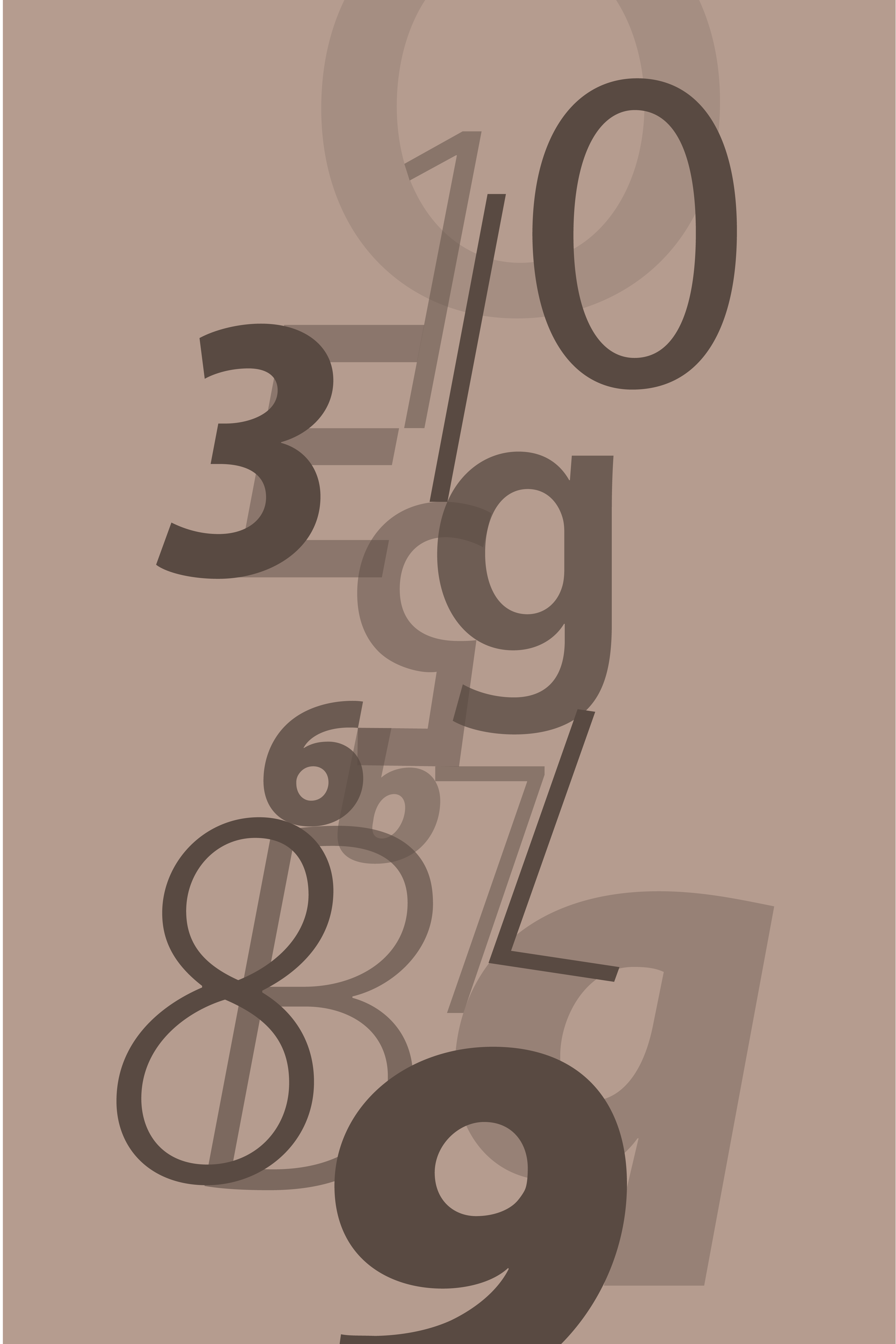
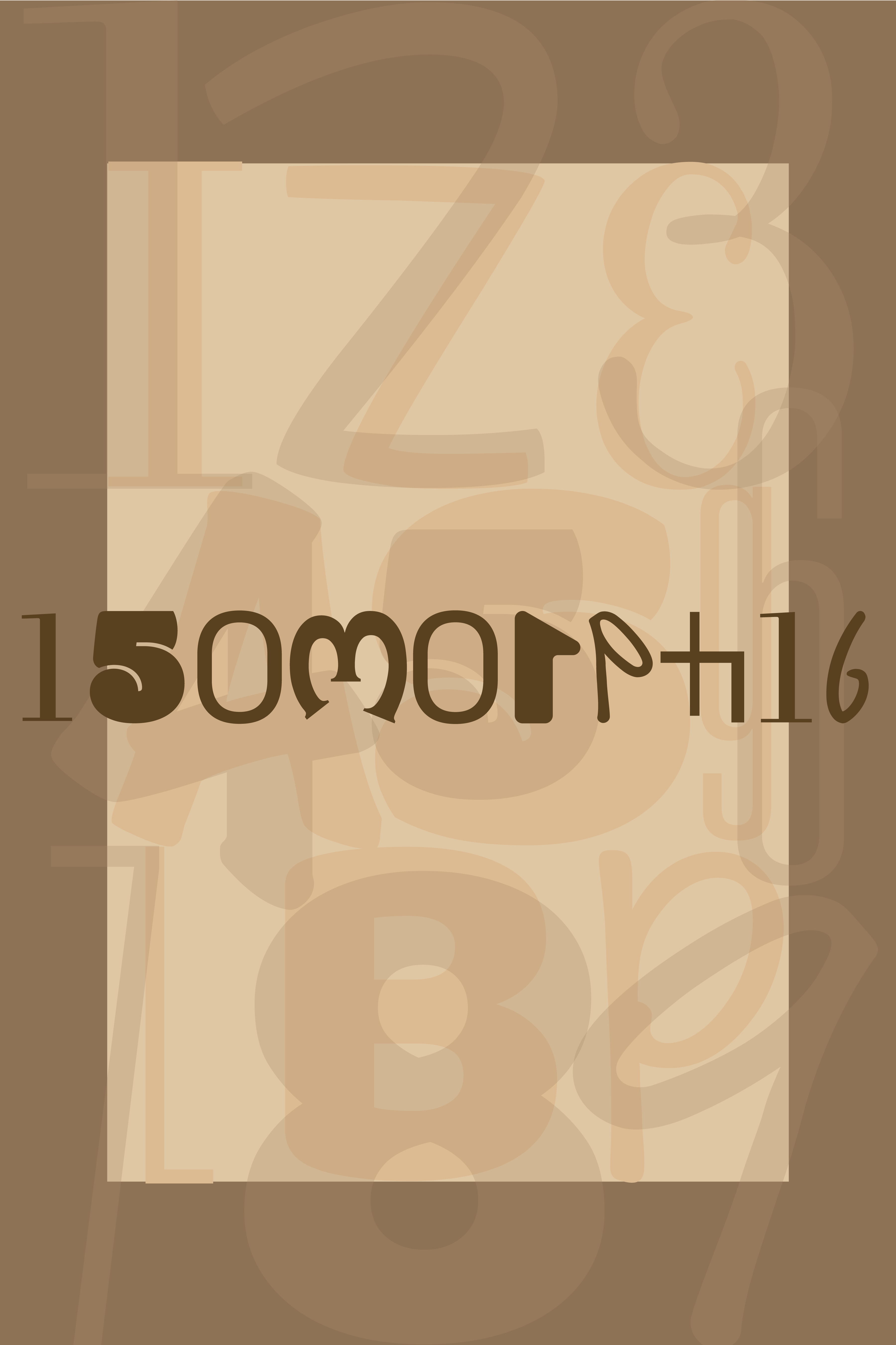
My posters revolve around the topic of Isomorphism. Isomorphism simply means corresponding or similar in form and relations. I have incorporated multiple meanings and ways in creation of posters.

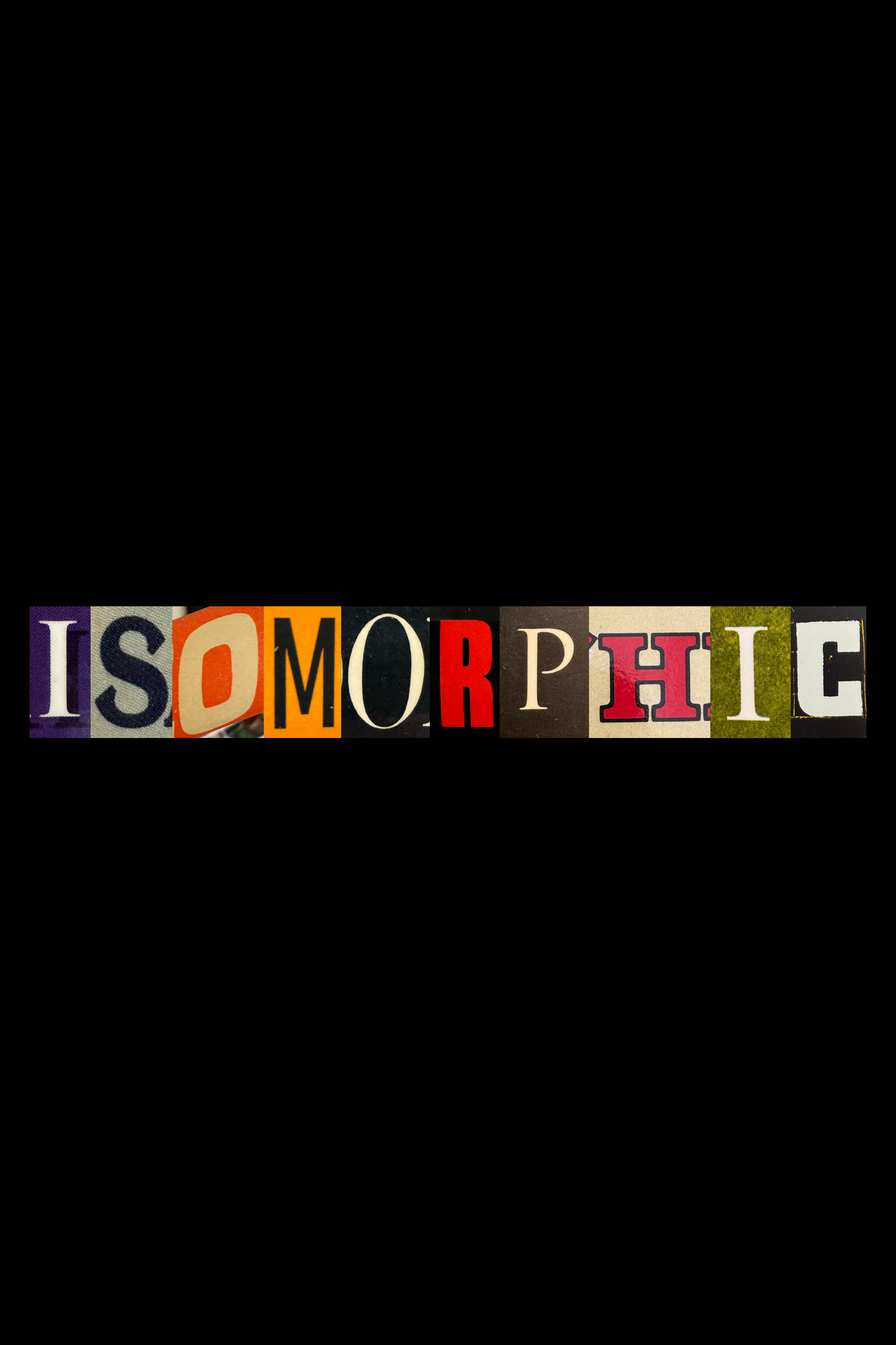
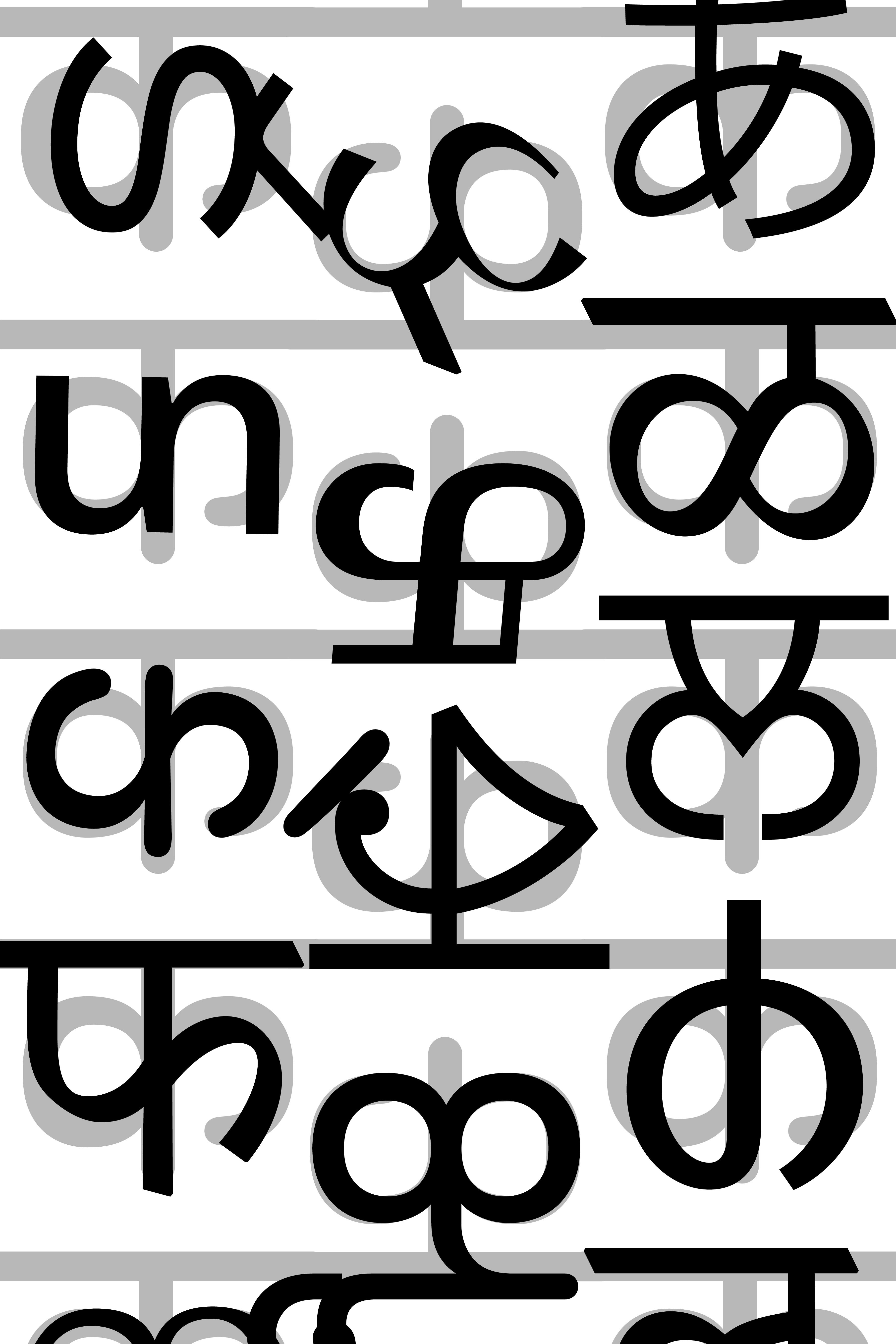
Representing the word through structural similarities in the way the letters are formed. In the next instance, the similarity is conveyed through variations in letterforms with distinct styles.
Exploring a grid-based arrangement of isomorphs to showcase complexity, and on the other hand blending alphabets and numbers that share a unified visual language.

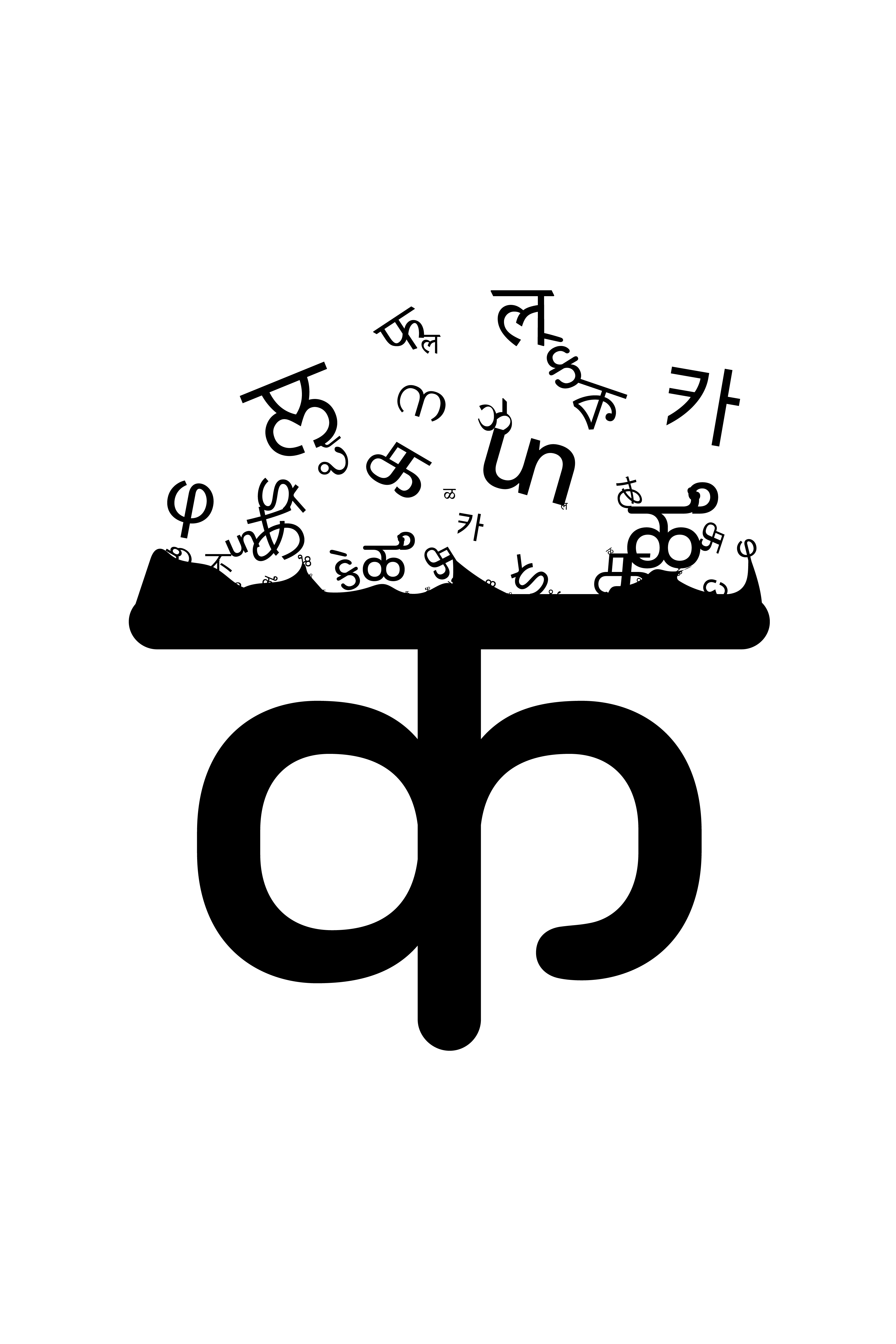
These posters emphasize typefaces and highlight instances of repeated letter structures. One poster features the letters b, d, p, and q, which are essentially rotated variations of one another. The other poster focuses on the Devanagari letter क, illustrating how different languages can share similar visual elements while producing entirely distinct sounds.
Using the letter क to symbolize isomorphism in a different context. The first poster highlights the visual connection through overlapping, clearly demonstrating the relationship. The second poster explores the similarity between alphabets and numbers by spelling out the word "isomorphic" entirely with numerals. Lastly, the third poster showcases lowercase alphabets that are mirror images of one another but, in reality, represent entirely different letters.

×
![Enlarged Image]()